Cynthia’s Blog #2: First Projects at InsuredTY

Hello! In this blog post, I will be writing about the first projects I completed at InsuredTY. My job was to work on branding, colors, fonts, and the remembering board.
Branding / Logos
Establishing a brand and designing a unique logo is challenging. More often than not, logos take multiple tries and revisions. I was tasked to design two completely different logos; targeted to different audiences.

My inspiration in making this logo was that I wanted to incorporate the koi fish.
Koi fish, also known as Japanese carp, is a known symbol in Japanese and Chinese culture.
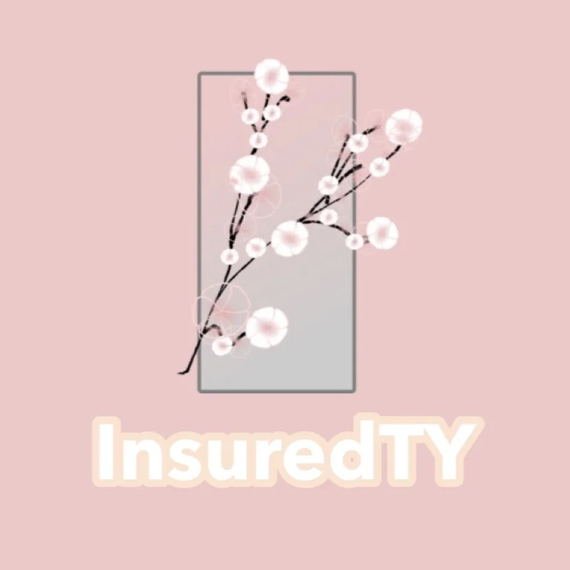
My inspiration in making this logo was that I wanted to incorporate the cherry blossom tree.
The cherry blossom tree originated in China, but developed in Japan. Cherry blossoms represent the nature of life, death, and renewal.
Fonts
There are an infinite amount of possibilities for fonts to choose from. Due to this, deciding on fonts result in a daunting task. I worked directly with Tim and Vivian to decide on an official font logo.
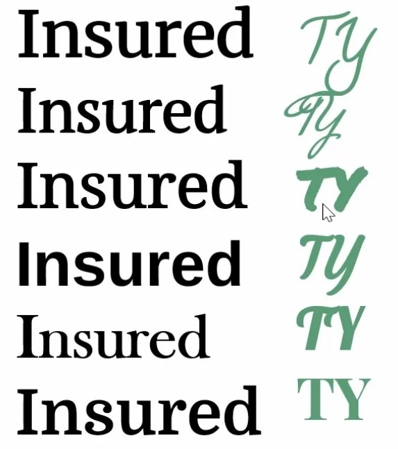
Determining an eye catching font for logos was not only difficult, but, was also fun and rewarding.
One process that we did to decide on a perfect font was to mix and match different “Insured” fonts and different “TY” fonts.
Colors
Having a consistent color scheme is an essential part of a brand. Colors are important both visually and psychologically.
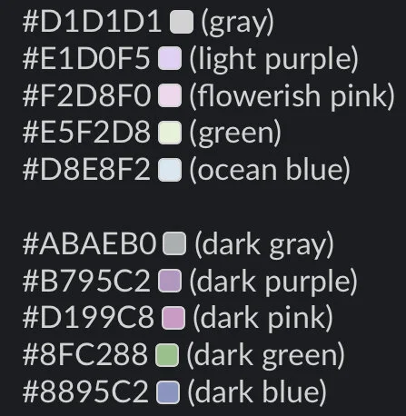
The colors that I chose were inspired by Tim’s mom’s flowers.
I decided to make two versions: a light version and a dark version.
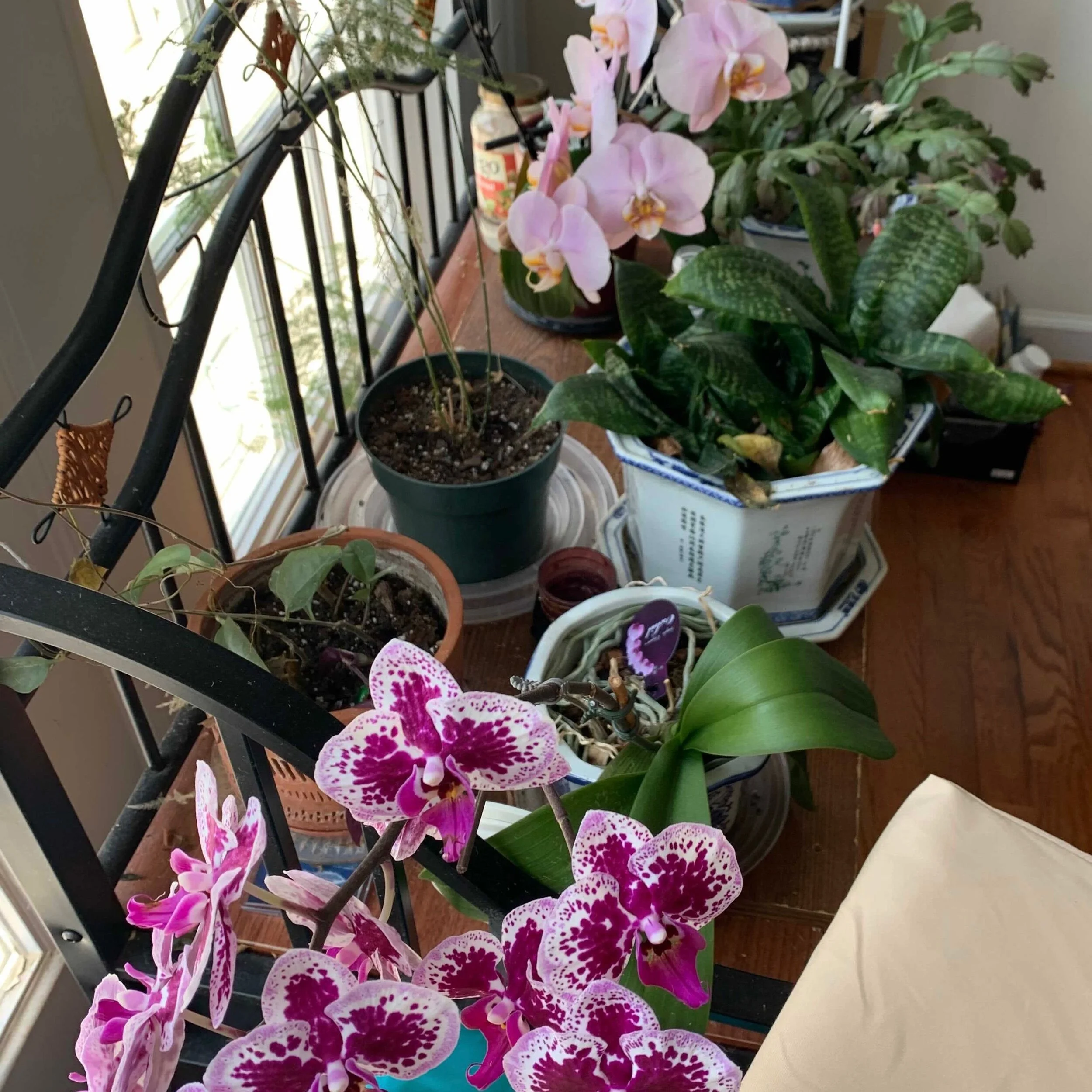
This is a picture of the inspiration!
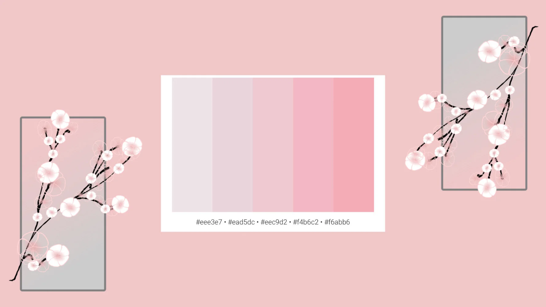
An example of a pink color palette!
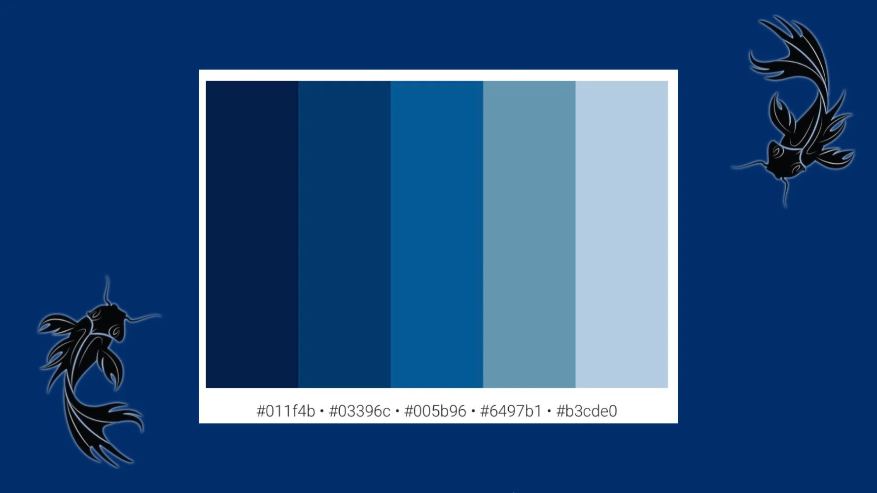
An example of a blue color palette!
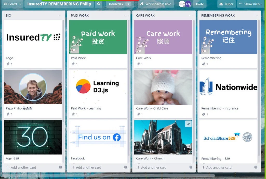
Remembering Board
My last task of the week was to work on and design a Remembering Board. I was assigned to design graphics for the visual aspect of the board. Using the color scheme that I chose, I incorporated it into the remembering board shown below.
Thank you for reading and joining me on my internship journey at InsuredTY!