Vivian’s Blog Post - Serif vs. San Serif: Logo Design, Colors, and Fonts
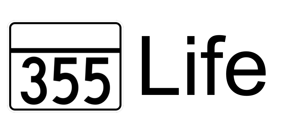
This week, I got my hands on some more technical projects, mainly with branding and also in learning and development with Hubspot. I really enjoy the self-improvement and hard skills that comes along with this internship! For branding this week, I experimented with some fonts as well as logos. Utilizing Canva, I drafted some logos for InsuredTY, trying to keep it simple but also have a larger meaning when further inspected. For example, there was a draft with a mountain in the backdrop showing that it’s a process to get insurance, but eventually, it’s worth it at the top of the mountain.

Logo Draft for InsuredTY
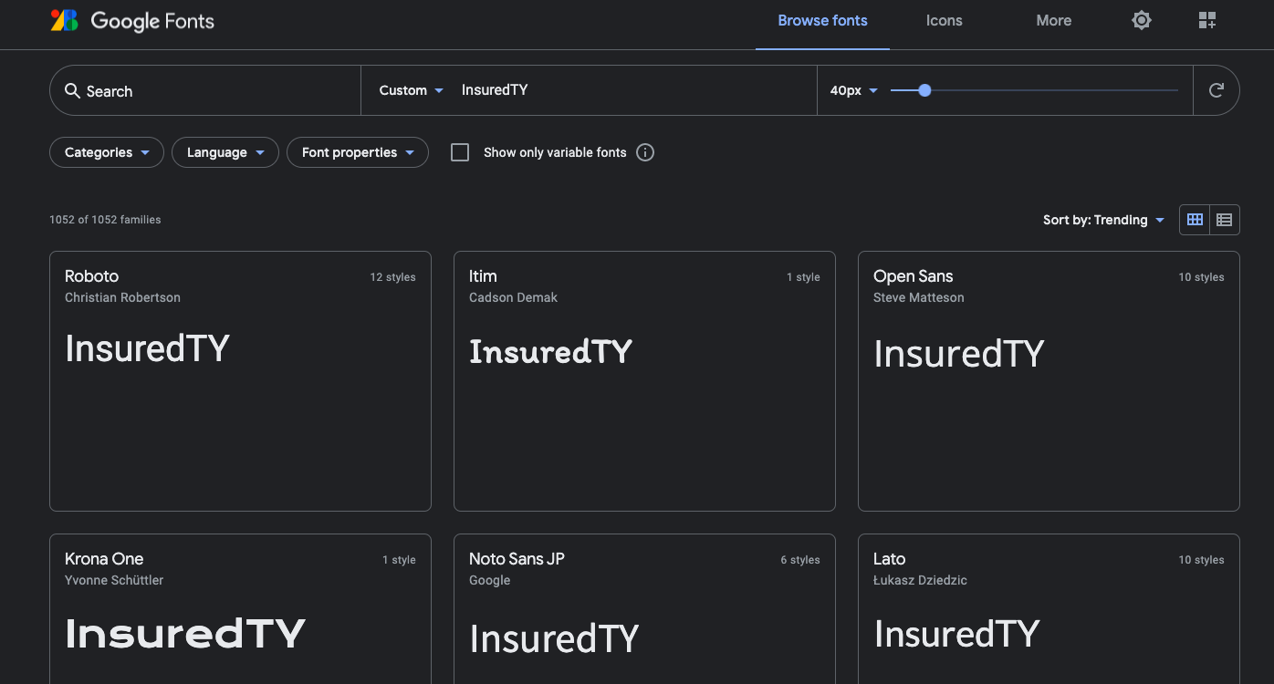
In addition to experimenting with logos, I also experimented with fonts. The Google fonts program was extremely useful in helping me visualize the font with the words I wanted to see used in that font. We debated heavily on whether or not to use Serif fonts or Sans Serif fonts; I preferred Serif fonts, such as Baskerville, because I liked that this font family had the small strokes on the bottom and ends of letters. I felt that this made the title and whatever was written in this font look more official, but I also recognized that Sans Serif fonts look more conversational and relatable, without the small strokes on the bottom. Sans Serif fonts like Arimo also looked pretty good as well, so I was also willing to compromise, because both had its pros and cons. Either way, we realized that Google fonts was very useful in helping us discover which fonts look the best. In addition, we wanted to have the “TY” in InsuredTY have a different font compared to the “Insured” part, so we looked into more casual, script-like fonts to have a signature-like feel to those letters and that part of the logo.
Going hand-in-hand with branding, I also tried out many color schemes and colorways for InsuredTY. I had originally used the website coolors.co, which is a color generator website that generates color schemes that complement each other. We were aware of some colors that we wanted to have in the universal color scheme, like a red and a navy blue, so I generated colors until I saw good reds and navy blues. In addition, the website also tells you exactly what HEX number the colors are, and lets you lock the colors in when you like them, so it was very useful in seeing some colors that I might not already be aware of.

After experimenting with coolors.co, I eventually kept track of the colors that we agreed was the best for adding into the color scheme, and we had discussions about whether or not those colors would work well with the brand. Ultimately, I ended up utilizing Microsoft Word to look at the colors together and play around with different shades of those colors. I started with the colors that I generated with the website, but then eventually moved on to different shades, whites, and grays that we thought would complement the other colors.
