Facebook Ads & Landing Pages Correlation Analysis [10 Examples]
Landing page and ad correlation is key to going from click to conversion. Once you have captured the audience with your ad, you need to convince them they have arrived at the right place, establish that you are reliable and call them to action. In this post I will analyze 10 insurance ads (mostly life insurance) and their respective landing pages. I will highlight the key landing page features and give them a score from 1-10 for landing page design and landing page-ad correlation.
Landing page features:
About us/Read more
Featured blog posts answering common questions
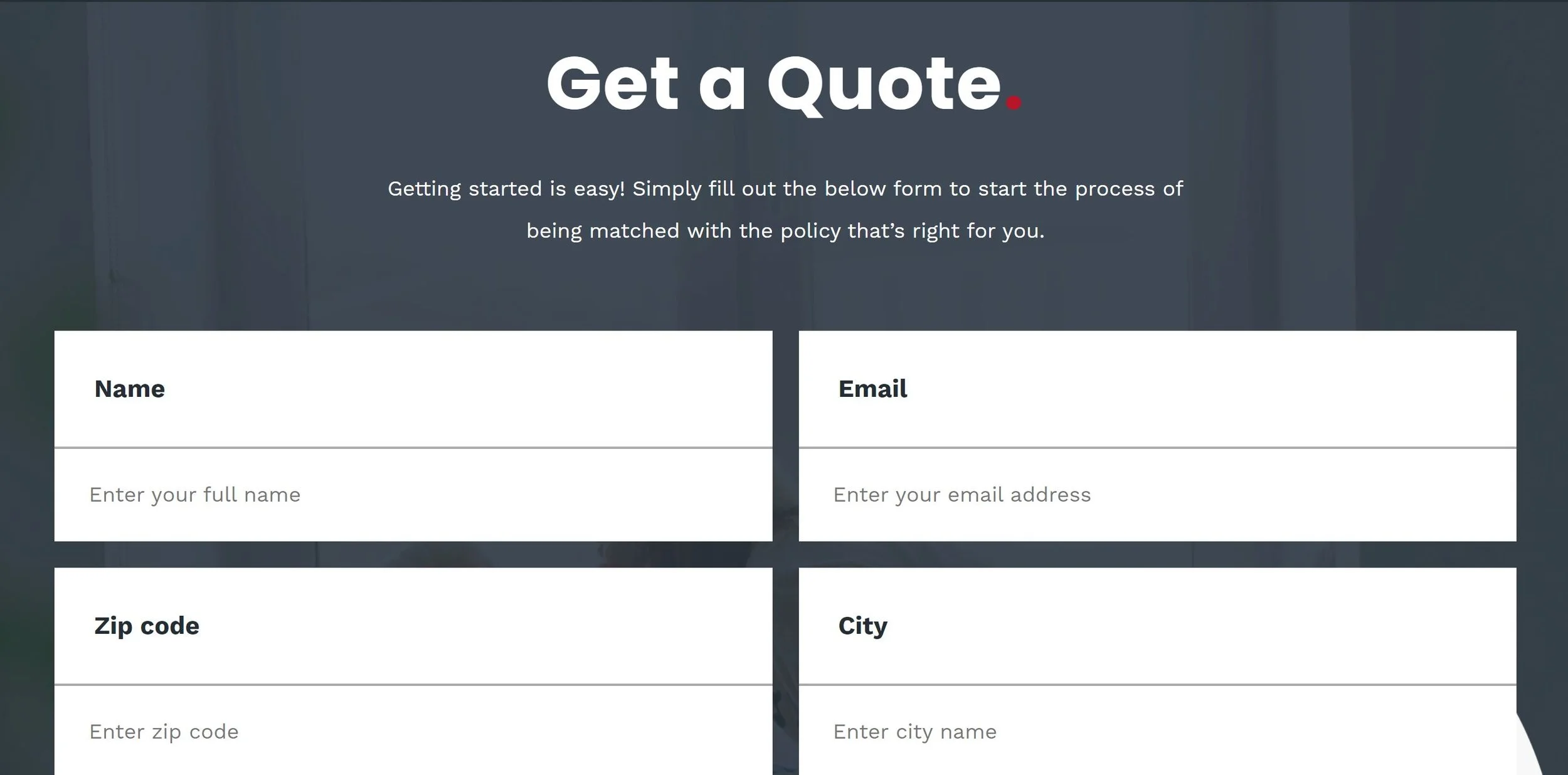
Quote form
Call to Action
Overall Rating 6/10 - Nice design. No call to action at the top. Medium ad landing page correlation (homepage not landing page).
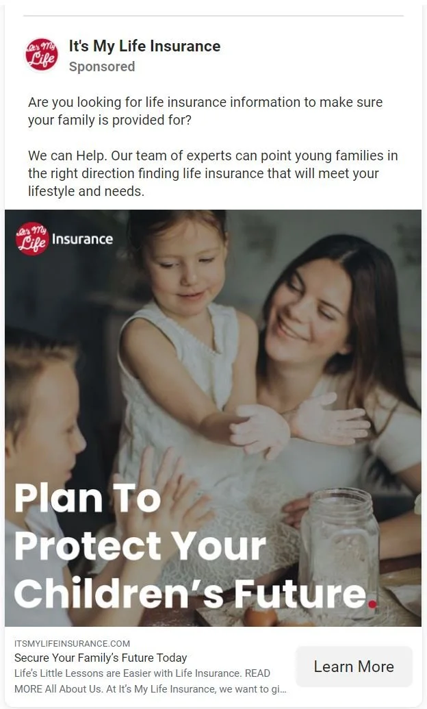
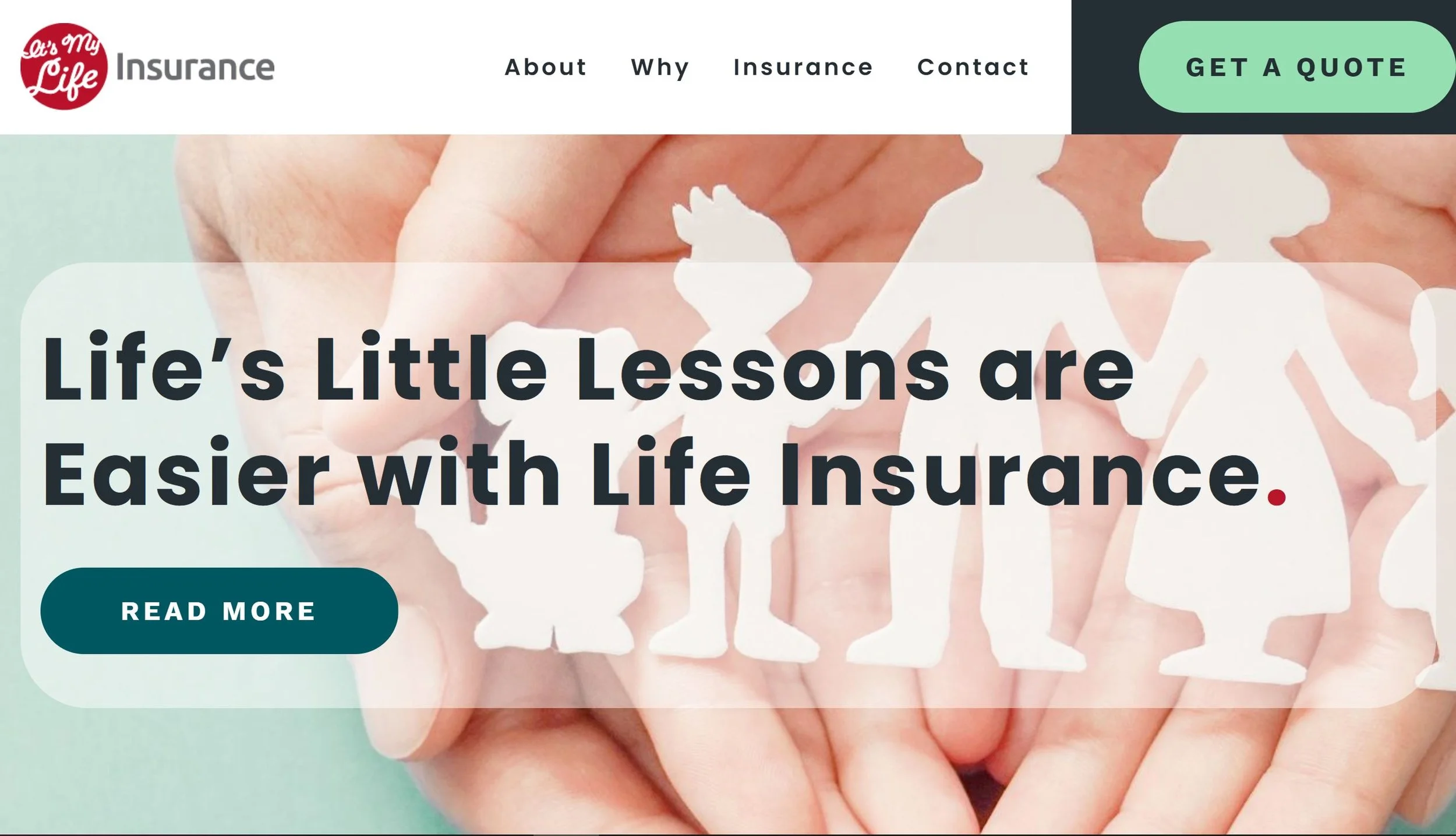
https://itsmylifeinsurance.com/
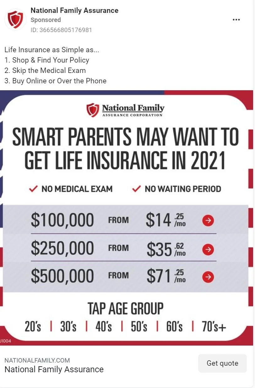
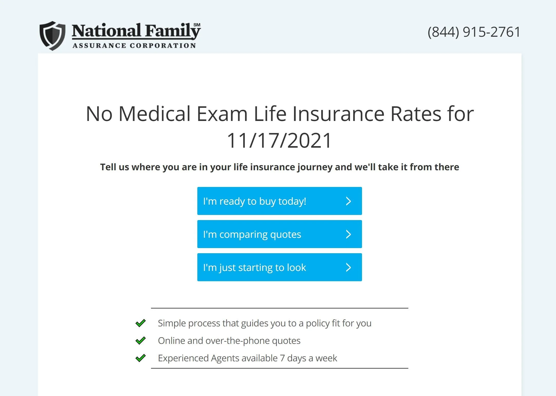
2. National Family Assurance
Landing page features:
Clear call to action buttons
Concise header
Three points
Overall rating 3/10 - Looks spamy, weak design, doesn’t establish credibility, low ad correlation.
https://nationalfamily.com/life-insurance-d-plus?utm_source=facebook&utm_medium=social&utm_campaign=%7B%7Bcampaign.name%7D%7D&utm_content=%7B%7Bplacement%7D%7D&utm_term=%7B%7Badset.name%7D%7D&utm_ad=%7B%7Bad.name%7D%7D&utm_kxconfid=t4k4r5s02#
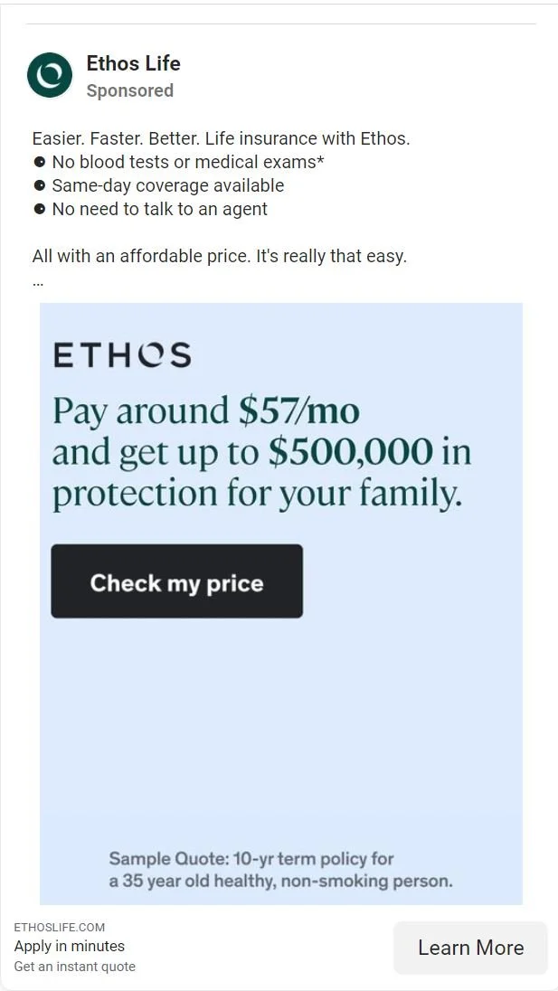
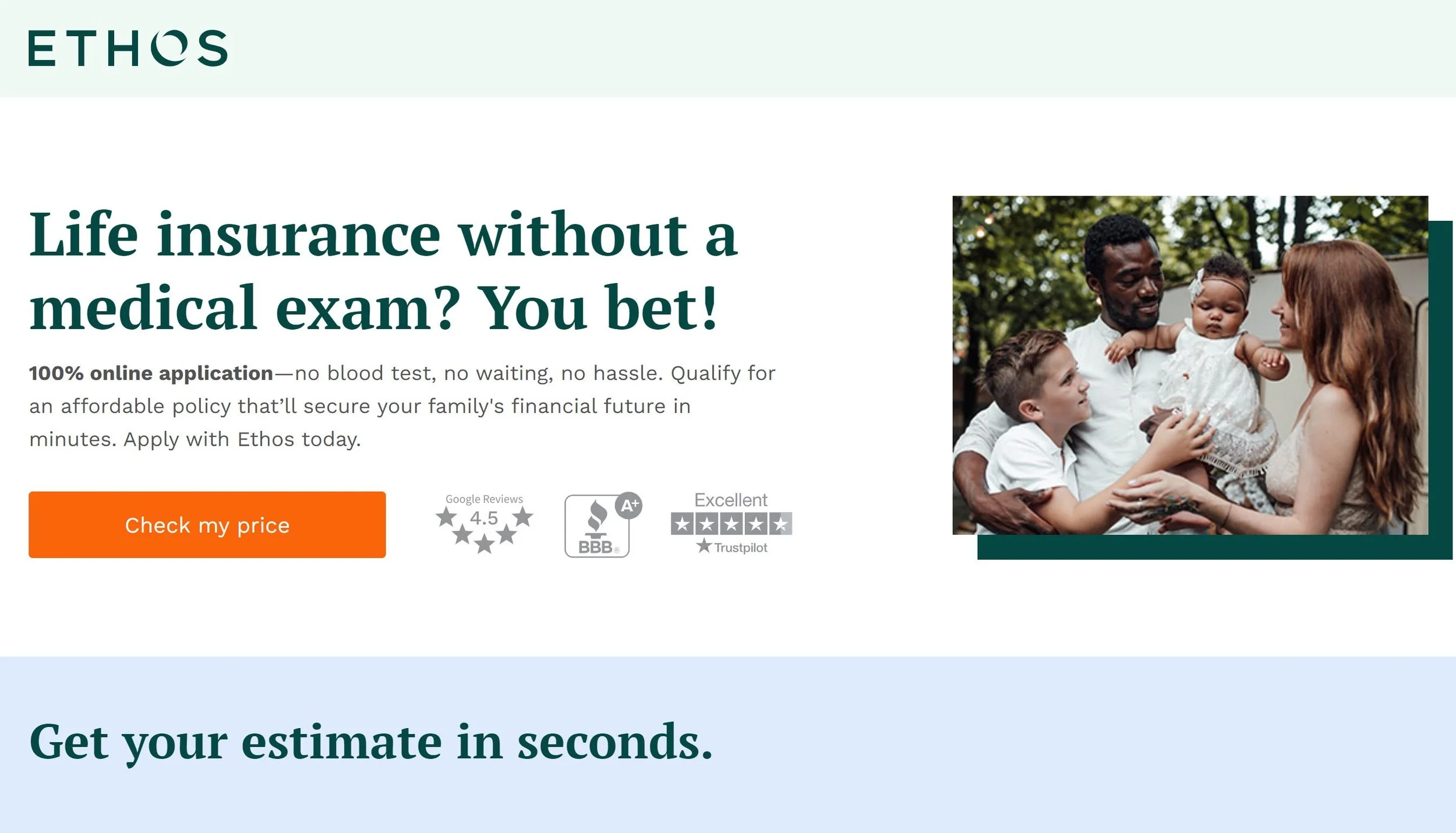
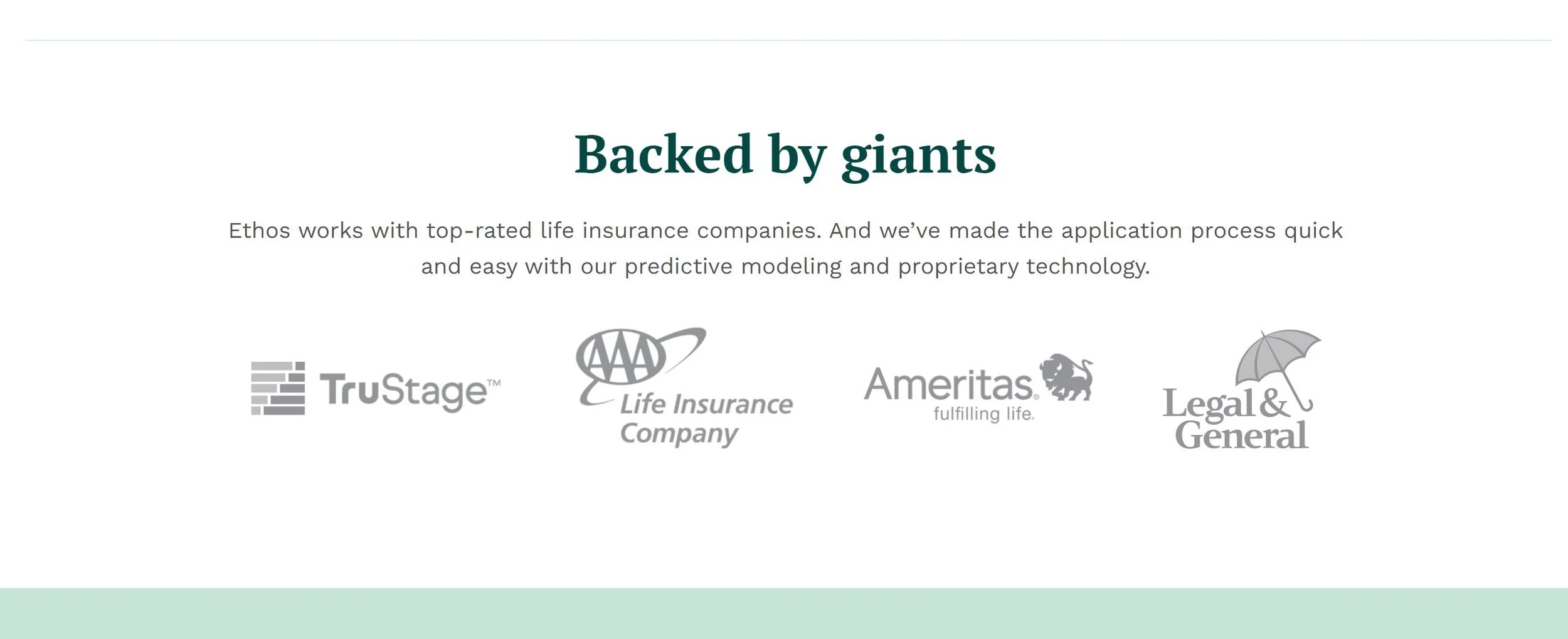
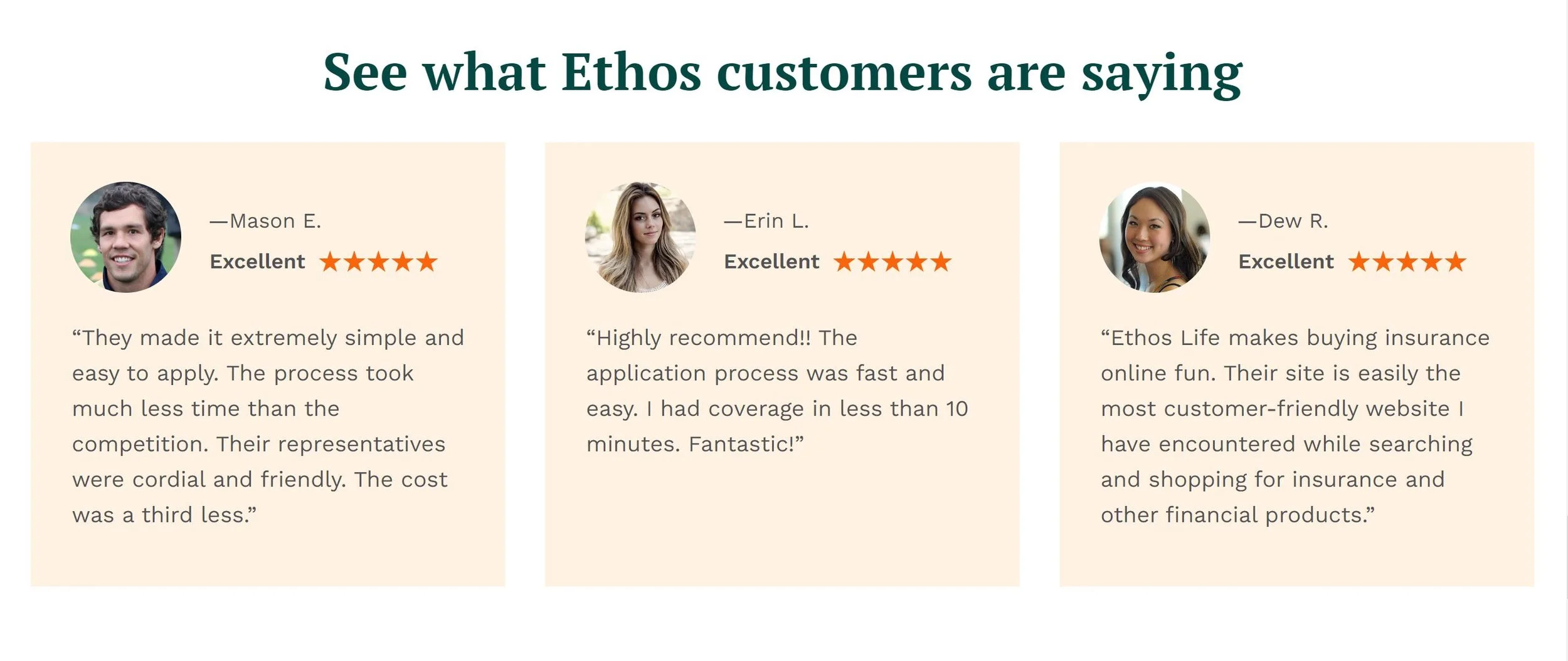
3. Ethos Life
Landing page features:
Multiple clear call to actions.
Clear concise heading.
Quote form.
Credibility - Informational, Brands, Reviews.
Overall Rating 9/10 - great landing page with a simple clear ad. Some correlation with colors and copy but missing a little with the main message.
https://get.ethoslife.com/no-medical-exam-ovw-credit-score
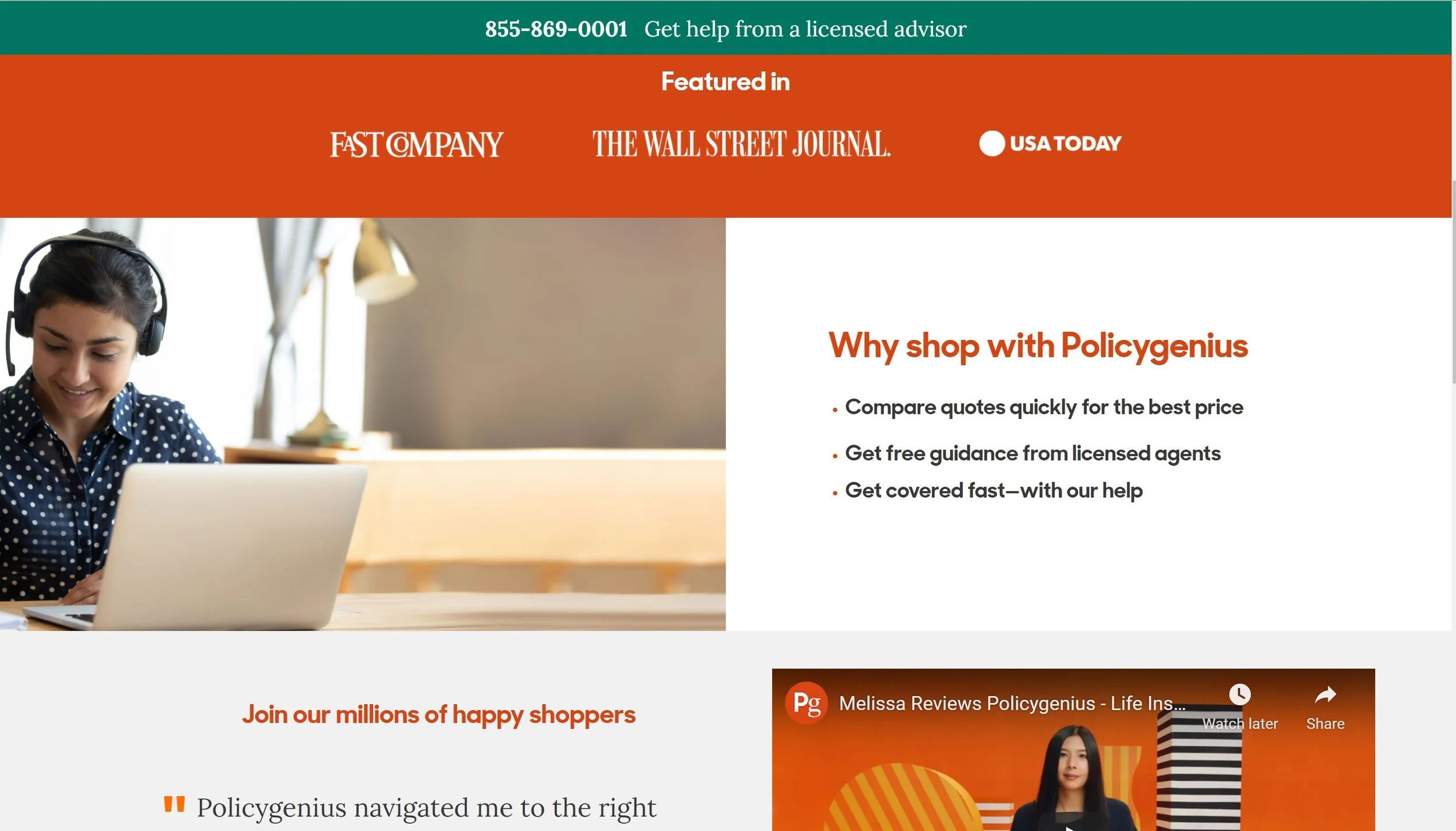
4. Policygenius
Landing page features:
Call to action before the fold.
Animated visual.
Credibility.
Video
Simple elegant design.
Overall Rating 8/10 - Some small design issues in the page. There is correlation with the ad in colors and message (numbers from the ad appear in the animation and popup) but it could be more obvious. No call to action under the ad.
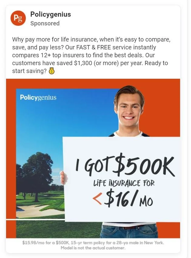
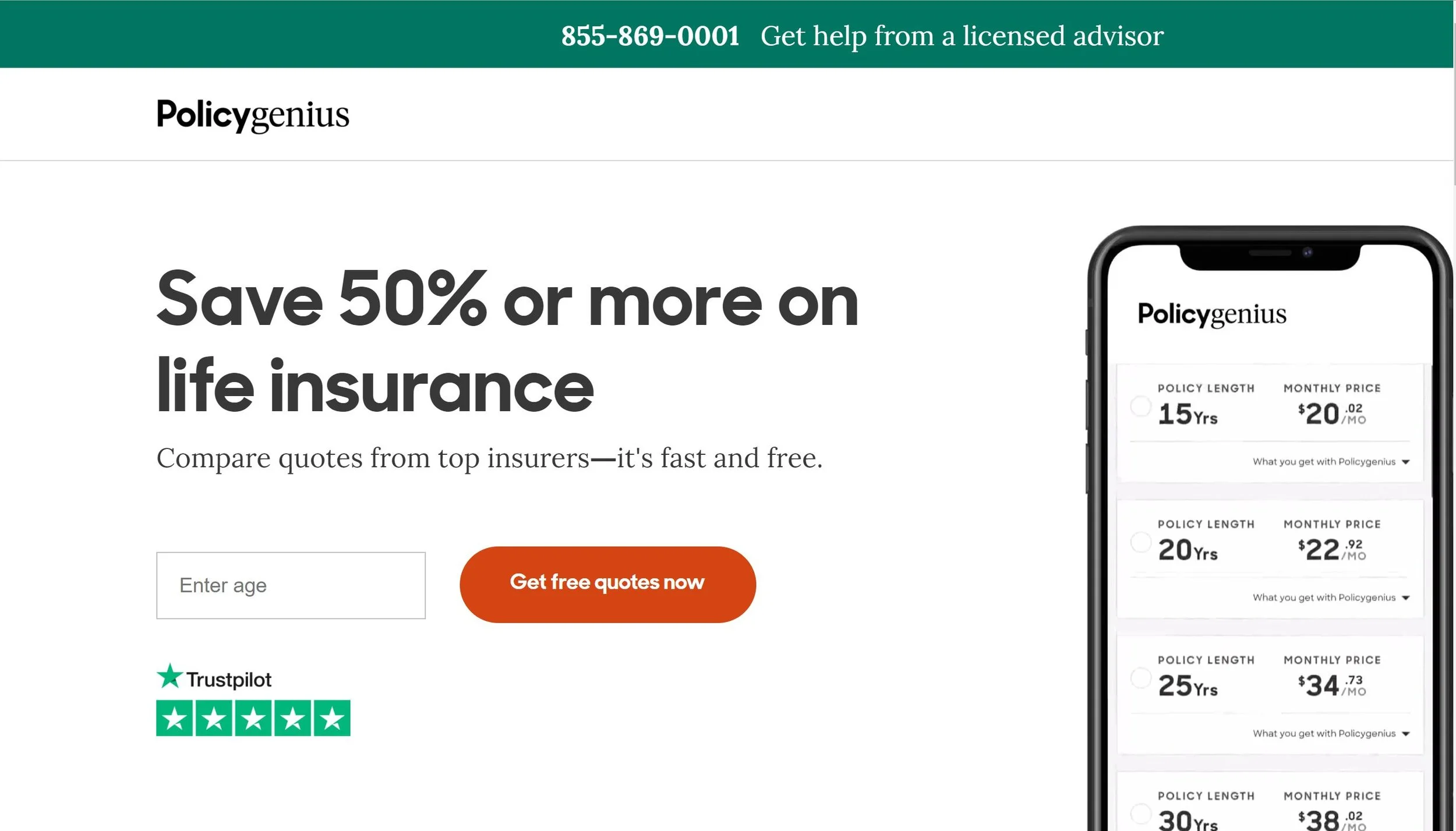
https://visit.policygenius.com/life-insurance/fb/?fbclid=IwAR2iboPfMLPOFqCUtaQRGYYSTrFcyBNGfoQaU09r089KoQW6p8xq-0p6Vps
5. Craig-Howard Insurance
Landing page features:
Clear header
Quote form
Overall Score 4/10 - No call to action button, design issues and bad choice of colors that makes it hard to see some words. The landing page does not establish credibility or authority. Relatively nice ad which leads to a very armature looking landing page, clearly a local agent and not a company. Colors don’t corollate.
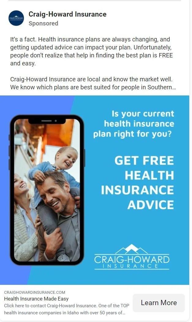
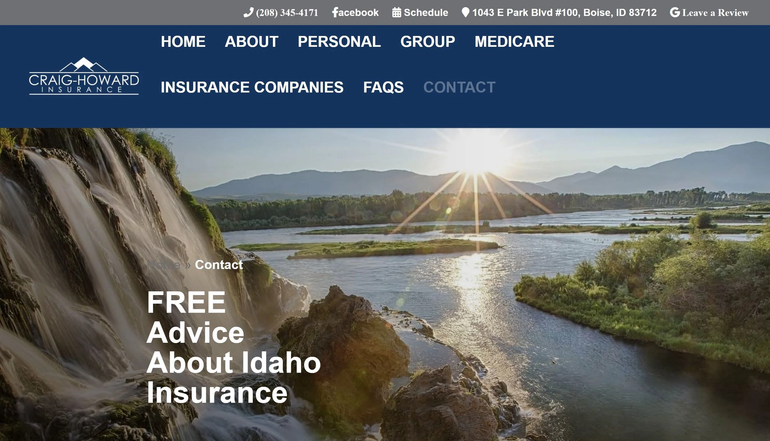
https://www.craighowardinsurance.com/free-advice-about-idaho-insurance/?fbclid=IwAR2Gz4EzWf9EqG-1TsmCYFs6GEBgaKv9pNisgC0q_nEXKRZ82EHFgdJi1AU
6. Nationwide
Landing page features:
Quote calculator
Overall score 5/10 - Pretty dull landing page for such a big brand but maybe that’s what they’re taking for granted. Pretty much just a calculator. Correlates to the ad somewhat but that’s pretty much it.
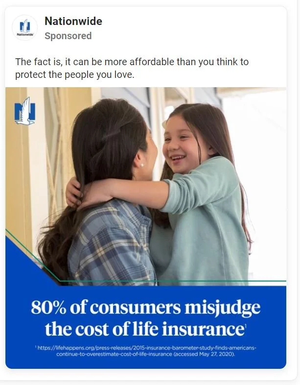
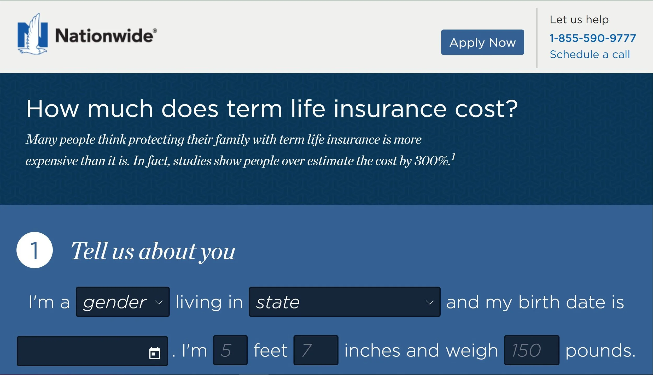
https://lifequote.nationwide.com/?utm_campaign=nf-d2c2020acq&utm_medium=social&utm_source=fb-ig&utm_content=quote&fbclid=IwAR1Chj3OCdm4lfOudH-zCRYthQyMie8aw32vi7t_tOM16LByd6bv0QP7Y4s
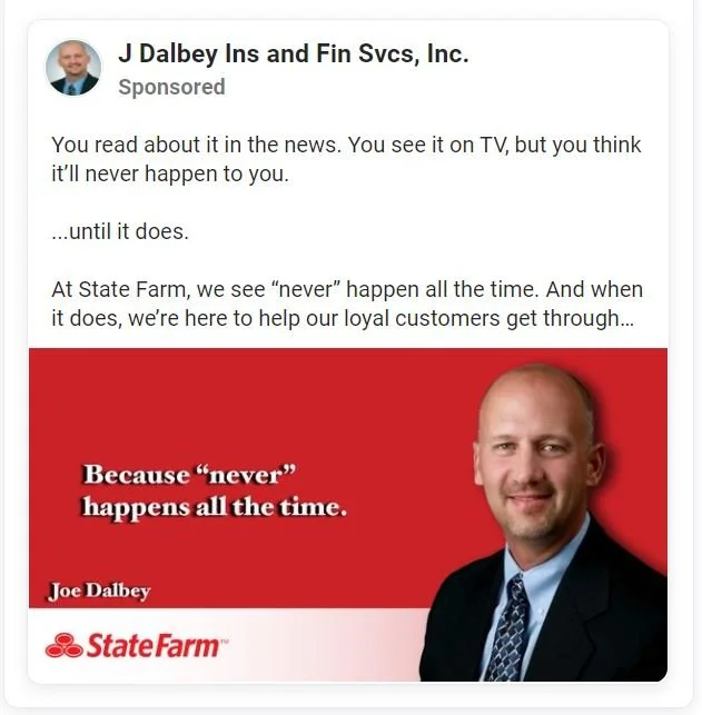
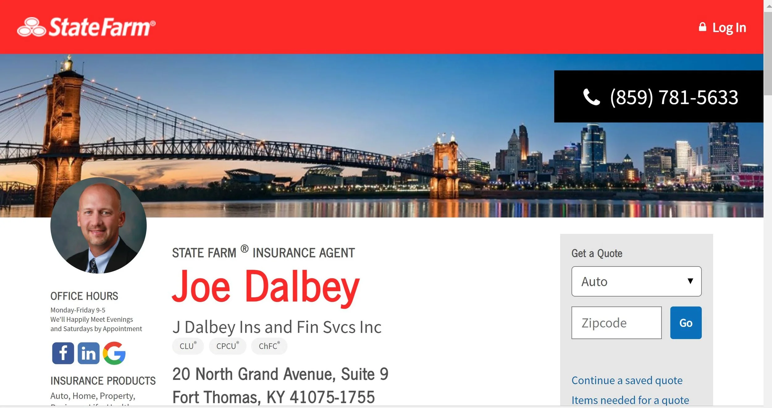
7. Joe Dalby (State Farm)
Landing page features:
More of an agent profile than a landing page.
Overall score 6/10 - It may not be a landing page but it is clear from the ad that its a State Farm agent’s personal ad. The colors correlate to the agent page and relevant contact information is provided. The agent is operating within the limits of the tools he has.
https://www.joedalbey.com/?fbclid=IwAR2D5aTZlzit0uxNkHx3_qU-of1RiwIvryS7x6HMR2coWH2BDrD6vSjhlmA
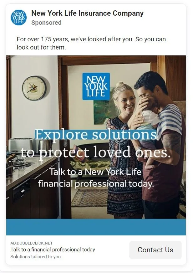
8. New York Life
Landing page features:
Header
Three points
Quote form
Overall score 6/10 - A small step above nationwide but still far below the other tech insurance companies. There is correlation between the ad and landing page wording but the design and visuals are bland and uninformative.
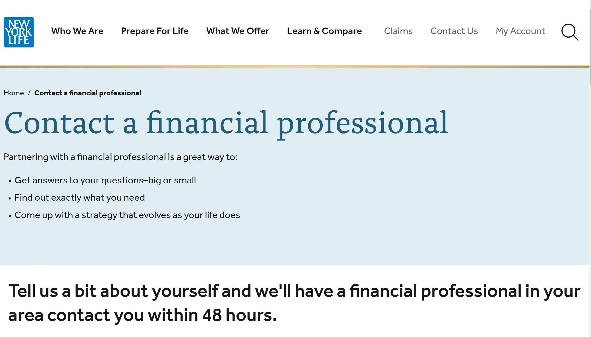
https://www.newyorklife.com/leads-agents/contact-a-financial-specialist?tid=1446&cmpid=SMC_AP_ConL_FB_na_na_na_LAL_HVLAL_CLForm_2ndc_0_0_0
9. Primerica
Landing page features:
Decent design.
Lots of information about how great Primerica is.
Call to action button.
Overall score 4/10 - This landing page basically assumes that I clicked on the ad just to read about how amazing their company is. Call to action is wayyy down on the page and leads to a directory. No real color theme. No correlation with the ad.
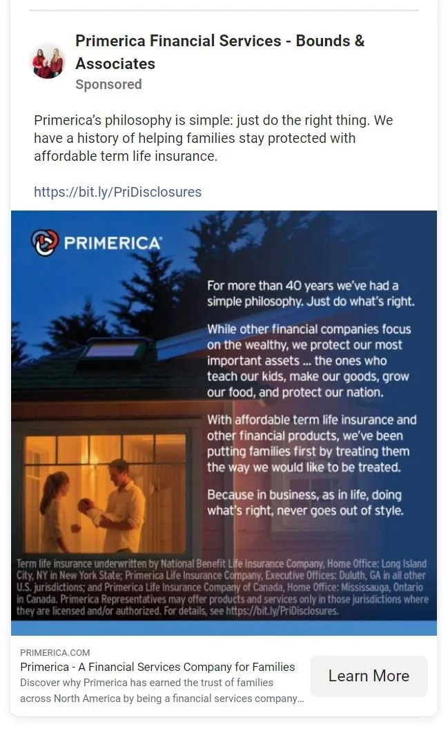
https://www.primerica.com/public/?fbclid=IwAR2ACHc4Pwfk8QRyZK2VfhgaccyY7Q7dcgGIkU6nrCBMcmm-uehAmNMV3qk
10. Kelly Zhang
Landing page features:
Kelly’s landing page is essentially her Facebook page.
Overall score 7/10 - Considering the circumstances Kelly’s Facebook page actually serves as quite a good landing page. You see many visuals of Kelly and her family and information about insurance. This along with 1000+ likes establishes credibility and the message popup makes it easy to get in touch. The call to action button could be changed from “Follow” to “Contact” or something of that sort. Looking at the page there is little doubt that Kelly is a really person who knows what she is talking about.
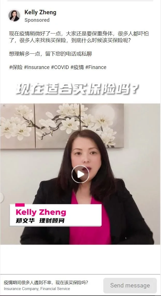

https://www.facebook.com/Kellyzheng817/
To conclude, I presented 10 different ads on Facebook and their corresponding landing pages (or equivalent of). Overall the big budget tech insurance companies seem to have the best understanding of what a landing page should look like, while the other big companies focus primarily on correlation and putting a quote calculator in front of the customers. Even some of the smaller fish do a good job with the tools they have whether it’s a parent company or open source tools. Without the performance data it is hard to determine right from wrong but there is good reason to think that those who do follow the rules for creating a high converting landing page should see more promising results.